Purpose of the Guidelines: These guidelines are designed to ensure the consistent application of the Love All Dat brand across all mediums and touchpoints. They provide detailed instructions on the use of our logo, color palette, typography, imagery, and voice.
Brief Overview of Love All Dat: Love All Dat is a leading source of clarity in the fintech world, dedicated to demystifying payment processing and merchant services for businesses of all sizes.
Brand Story
Mission Statement: To empower businesses with clear, accessible, and actionable fintech insights, fostering informed decision-making and growth.
Vision Statement: To be the definitive resource for payment processing and merchant services knowledge, where clarity and understanding drive innovation and success.
Core Values: Clarity, Reliability, Empowerment, Innovation.
Brand Personality: Expert, Trustworthy, Accessible, Forward-thinking.
Logo Usage
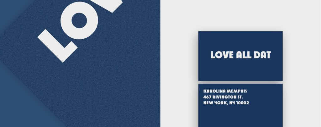
Primary Logo Design and Variations: Our logo features a stylized representation of the Love All Dat name, embodying simplicity and clarity. Variations include full-color, monochrome, and icon-only versions.


Logo Sizing and Spacing: The logo must maintain a minimum clear space of its height around all sides and should not be scaled below 30px in digital media or 0.5in in print.
Incorrect Logo Uses: Do not alter the logo’s colors, proportions, or add any effects like shadows or gradients.

Color Palette
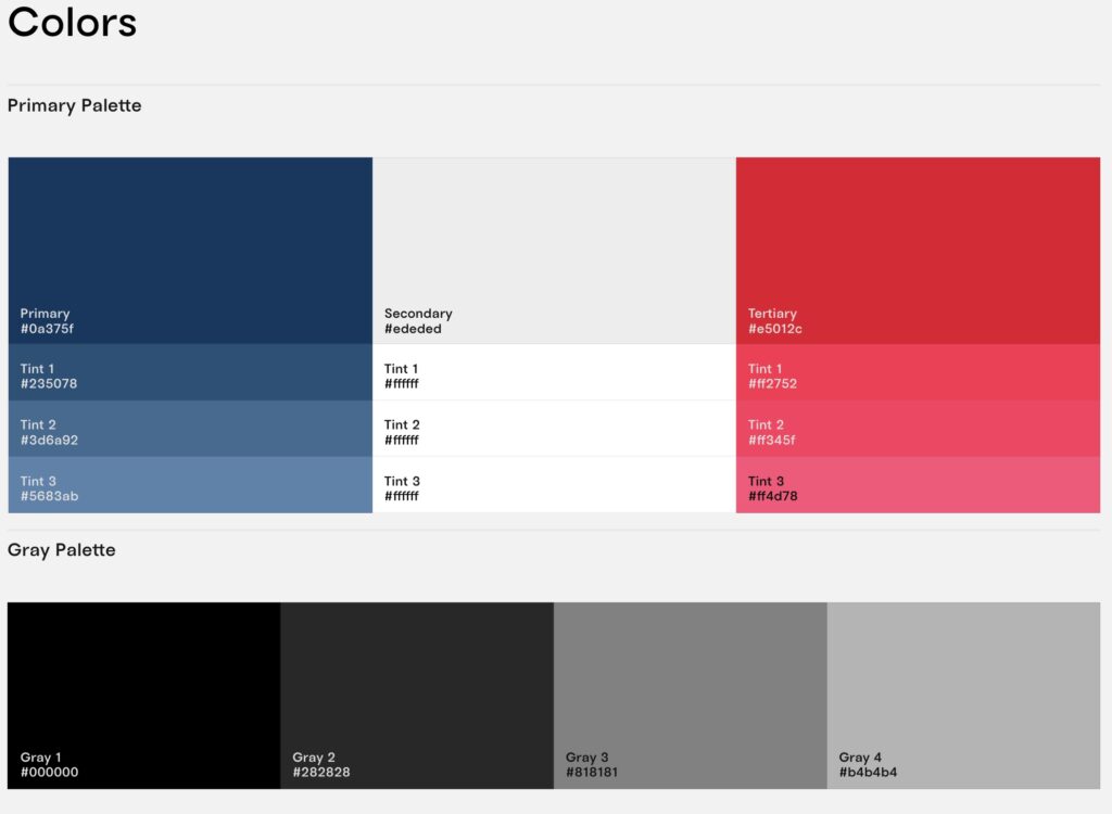
Primary Colors: Deep blue shades that convey trust and reliability.
- Primary: #0a375f (RGB: 10, 55, 95)
- Tint 1: #235078 (RGB: 35, 80, 120)
- Tint 2: #3d6a92 (RGB: 61, 106, 146)
- Tint 3: #5683ab (RGB: 86, 131, 171)
Secondary Colors: Neutral shades for balance and versatility.
- Secondary: #ededed (RGB: 237, 237, 237)
- Tint 1-3: #ffffff (RGB: 255, 255, 255)
Tertiary Colors: Vibrant reds for calls to action and accents.
- Tertiary: #e5012c (RGB: 229, 1, 44)
- Tint 1: #ff2752 (RGB: 255, 39, 82)
- Tint 2: #ff345f (RGB: 255, 52, 95)
- Tint 3: #ff4d78 (RGB: 255, 77, 120)
Gray Palette: For background, text, and secondary elements.
- Gray 1: #000000 (RGB: 0, 0, 0)
- Gray 2: #282828 (RGB: 40, 40, 40)
- Gray 3: #818181 (RGB: 129, 129, 129)
- Gray 4: #b4b4b4 (RGB: 180, 180, 180)
Imagery and Photography
Style and Tone: Images should be clear, modern, and resonate with the fintech industry, reinforcing our brand’s commitment to clarity and accessibility.

Acceptable Types of Imagery: Professional photos that depict technology, finance, and business environments. Avoid using overly stylized or abstract imagery.
Usage Guidelines: Ensure images are high resolution and properly licensed. Use imagery to enhance comprehension and engagement, not distract.
Graphic Elements
Icons: Simple, clean icons to convey key information quickly.
Patterns: Minimalistic patterns for subtle background textures, aligning with our color palette.
Other Design Elements: Use sparingly to maintain a clean and uncluttered look.
Voice and Tone
Personality Traits: Informative yet approachable, with a tone that balances professionalism with accessibility.
Writing Style: Clear, concise, and jargon-free. Tailor the style according to the platform, ensuring it’s engaging and informative.
Examples: “Unlock the potential of your business with our easy-to-understand guide on payment processing.”
Application Examples
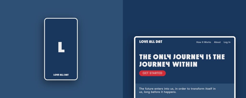
Website: Use primary colors for navigation and calls to action, with secondary and tertiary colors for accents and highlights. Typography should ensure readability and accessibility.

Marketing Materials: Maintain logo integrity and color usage consistency. Imagery should reflect the brand’s commitment to clarity and empowerment.
Social Media Profiles and Posts: Consistent use of logo, colors, and tone to reinforce brand identity across platforms. Engage with the audience in a helpful and informative manner.
Social Media Guidelines
Profile Branding: Ensure logos and banners are updated and consistent with branding guidelines.

Post Formatting: Maintain a consistent voice and tone. Use hashtags strategically to increase visibility.
Engagement Guidelines: Respond to comments and mentions in a timely, respectful manner, providing value with each interaction.
Email Communication
Email Signature Format: Include name, position, and contact information, using the primary color palette.
Templates: Design for newsletters and announcements should align with brand colors, typography, and voice.

Packaging and Merchandising
Packaging Design Principles: Reflect brand colors and logo usage, focusing on simplicity and clarity.
Merchandising Materials Guidelines: Ensure brand consistency, from promotional items to in-store displays.


